

Captial One I OAO Redesign
Date: 2015 - 2016
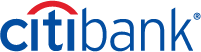
Capital One's redesign began with a practical reason, the current flow wasn't meant to support multiple products, it was originally designed to open single checking accounts. Second, we had the opportunity to do so much more for our customers by giving them the choice to experience multiple products that would allow them to live better and strengthen our banking relationship.
Case Study | Outline
Team | Individual Contribution
Design Process | An In-depth Look
High Fidelity | A New Look
Result | The Outcome
Team | Individual Contribution
TEAM - 7
Director of Product
Product Manager (2)
Researcher
Product Designer
Content Strategist
Marketing
POSITION ON TEAM
Lead Product Designer | Visual Design
MY PART (within the redesign)
Partnered with content strategy to craft the language used in our experience
Partnered with research to conduct competitive field research
Moderated user interviews
Partnered in user journey exercises
Responsible for end-to-end UX experience
Design Process | An In-depth Look
Below is an in-depth overview that details a design process that helped uncover design problems, find design solutions, and solve customers' needs. It afforded ways to create solution sketches, receive peer feedback, build prototypes and get critical feedback from our customers.
Most importantly, through this design process I was able to validate and feel confident conveying my decisions to stake-holders while cleanly managing my day-to-day work flow.
Design Process | Outline
01 Map | Understand the problem
02 Sketch | Sketch solutions
03 Decide | Choose a direction and storyboard
04 Prototype | Design mocks and create a prototype
05 Test | Get feedback on your prototype
Based off Google Ventures design process
01 Map | Understand the Problem
• User Interviews
• User Interviews
• User Stories
OBJECTIVE
In the mapping phase, I partnered with research & product to help identify the following: customer needs, users behaviors, facts, needs & goals while making assumptions and listing out key actions that users may want to utilize in their experience. Our objective was to find an opportunity to tastefully introduce multiple products within the on-boarding experience (Debit Card, Direct Deposit, Mobile App, Fees & Transactions, Over Draft, Protection, Alerts, Financial Advice) plus strengthen trust with our customers through language.
DELIVERABLES
User Interviews
My journey in the Map phase began by competitive field research where I recorded and transcribed three separate competitors' on-boarding experiences to understand & identify the language our competitors used to guide their customers into opening a checking account. We also wanted to capture techniques used to earn the trust of new customers. Lastly, at what point during the experience do our competitors offer other products within the on-boarding process.
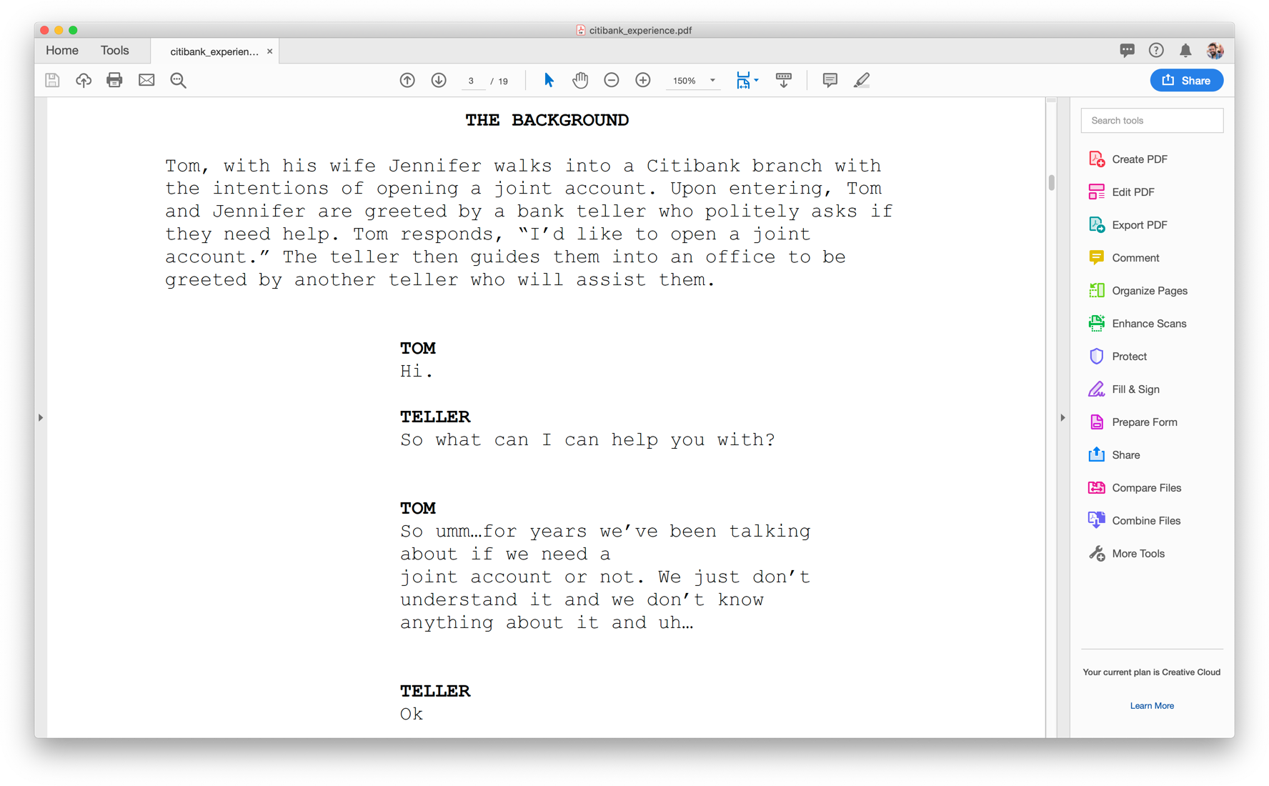
The second part of our (my) user interview experience focused on our 360 Cafe associates. How do our 360 Cafe associates build trust of new customers looking to open a checking account within a cafe setting? I interviewed two 360 Cafe associates and two users.
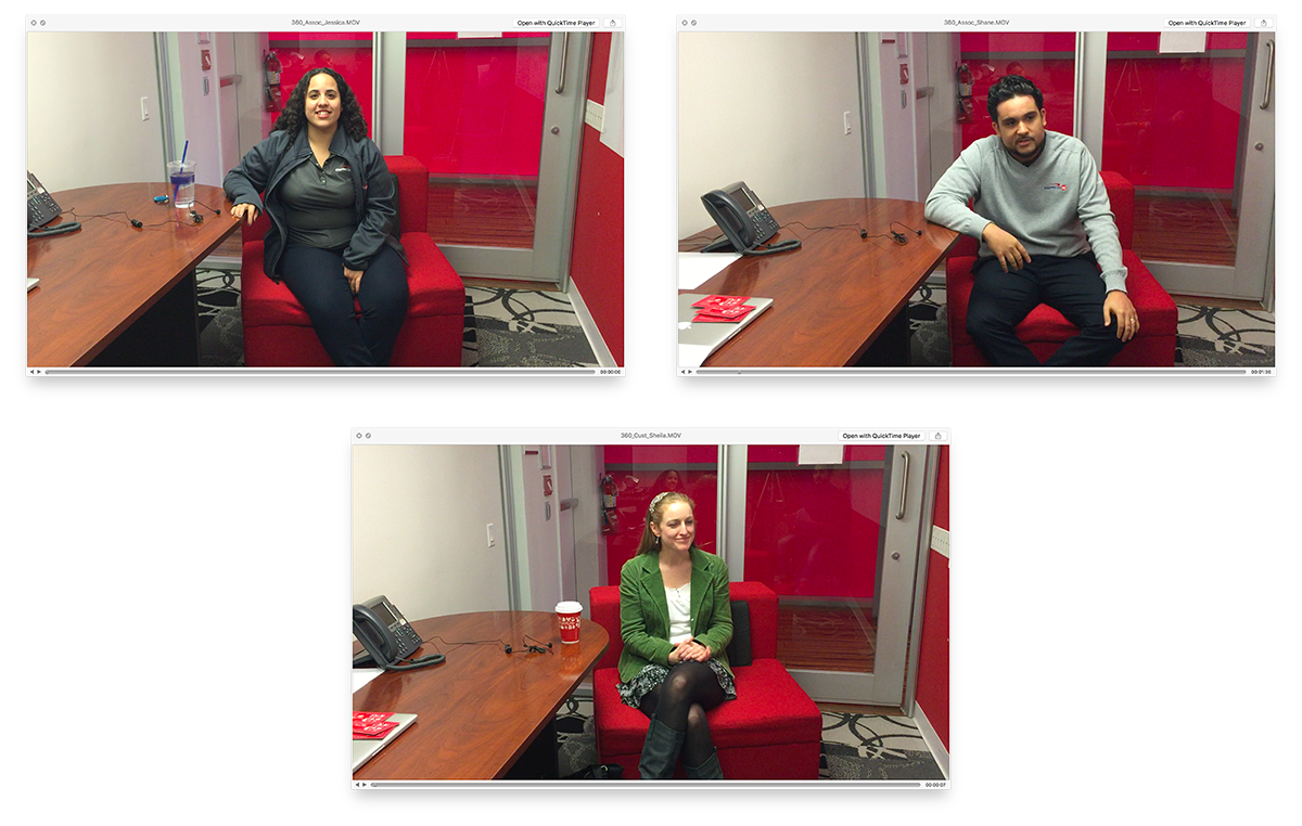
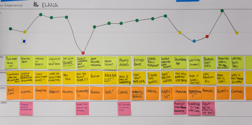
The last part in this objective, I participated in a user journey team exercise session where each associate (6 team members) ran a user journey study on two participants to understand real-human experiences that drove participants to open a checking account. This user journey exercise was centered around what a person is doing, thinking & feeling during their experience.
User Stories
User stories were not used in the map phase.
RESULTS
In the branch experience, we discovered each competitor perfectly timed moments not recognized in real-time to up-sell products which was an internal pain-point of Capital One; “How can we up-sell our products in our experience to generate revenue without turning a user away?” Recording and transcribing these experiences gave insight into that. It wasn’t about what our competitors were “up-selling”, it was how they were up-selling.
In the 360 Cafe setting, we discovered road-blocks that interfered in customers trusting CapitalOne in a cafe setting. This experience began to define behavioral differences between web, cafe and a physical branch. Lastly, common security behaviors did not change regardless of the experience such as customers cautiousness around their social security number.
In the user journey experience, six teams converged, shared insights, gathered data to help us further understand the similarities and differences between each participant within opening a checking account. This mapping session widened the spectrum and helped us define, why and how a customer would open a checking account.
In closing, in this phase we were able to discover how competitors up-sell within their on-boarding experience for features such as: Debit Card, Direct Deposit, Mobile App, Fees & Transactions, Over Draft Protection, Alerts, Financial Advice, plus, how they use language to communicate and build trust.
Competitive branch experience (account opening experience)
360 Cafe associate and customer interviews

User journey experience
02 Sketch | Sketch Solutions
• Lightning Demo
• Lightning Demo
• Solution Sketches
OBJECTIVE
From the Map phase, we gathered extensive amounts of research that helped design several solutions based around language-use and up-selling products within an on-boarding process. Our objective was to simply deliver a seamless on-boarding experience that was friendly and tasteful when up-selling products that may improve our customers experience.
From the Map phase, we gathered extensive amounts of research that helped design several solutions based around language-use and up-selling products within an on-boarding process. Our objective was to simply deliver a seamless on-boarding experience that was friendly and tasteful when up-selling products that may improve our customers experience.
DELIVERABLES
Lightning Demo
Lightning Demo
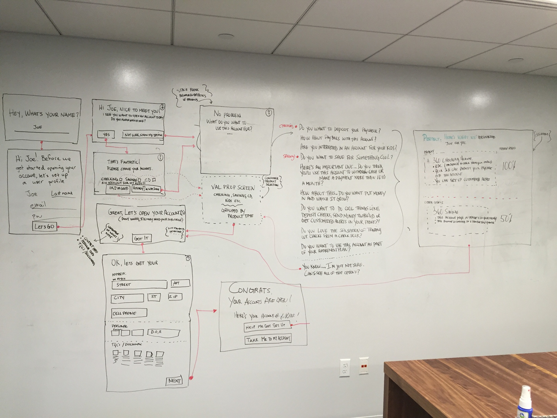
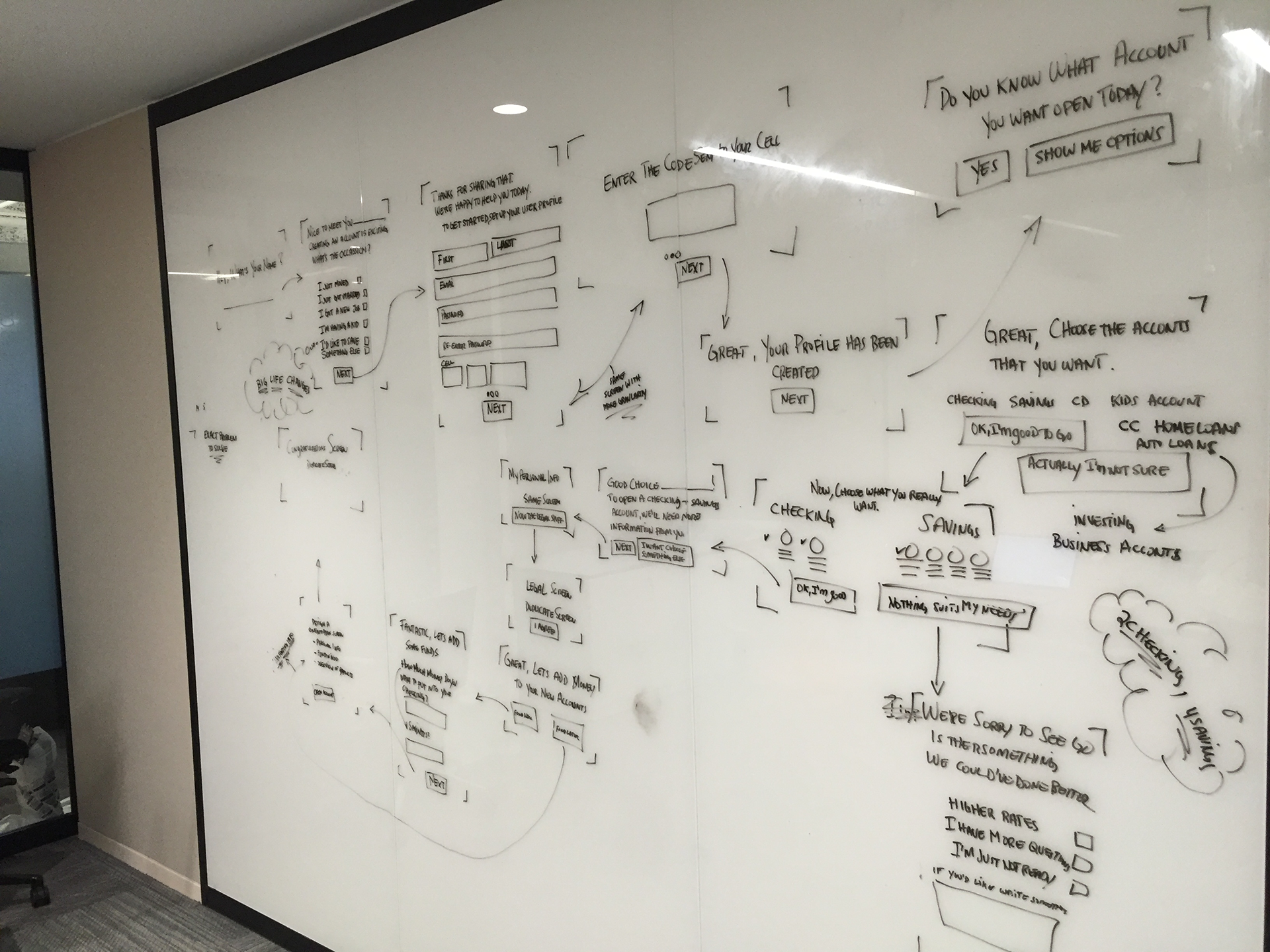
In the Sketch phase, it was now time to assess our competitors products and jot ideas we could utilize and expand on within our experience. Essentially modify what our competitors did well and not do well to solve our solution.
Solution Sketches
In the Solution Sketch phase, I was drawing solutions (on a whiteboard) with the help of our PM's. The PM's were inputting their perspectives based on MVP features, past research and business goals. Together we were able to draw out several design solutions we felt strongly moving forward with.
RESULTS
Multiple flows were created and fleshed out during the sketching phase.
03 Decide | Choose Direction and Storyboard
• Getting Feedback
• Getting Feedback
• Storyboard
OBJECTIVE
In the deciding phase, the objectives were to collect my team's feedback and choose which Solution Sketch solved the problem best. Having the opportunity to gather feedback from my peers, proved to be a vital component in the redesign process. It allowed my team to know exactly where I'm at and the decisions that were being made.
In the deciding phase, the objectives were to collect my team's feedback and choose which Solution Sketch solved the problem best. Having the opportunity to gather feedback from my peers, proved to be a vital component in the redesign process. It allowed my team to know exactly where I'm at and the decisions that were being made.
DELIVERABLES
Getting Feedback*
Getting Feedback*
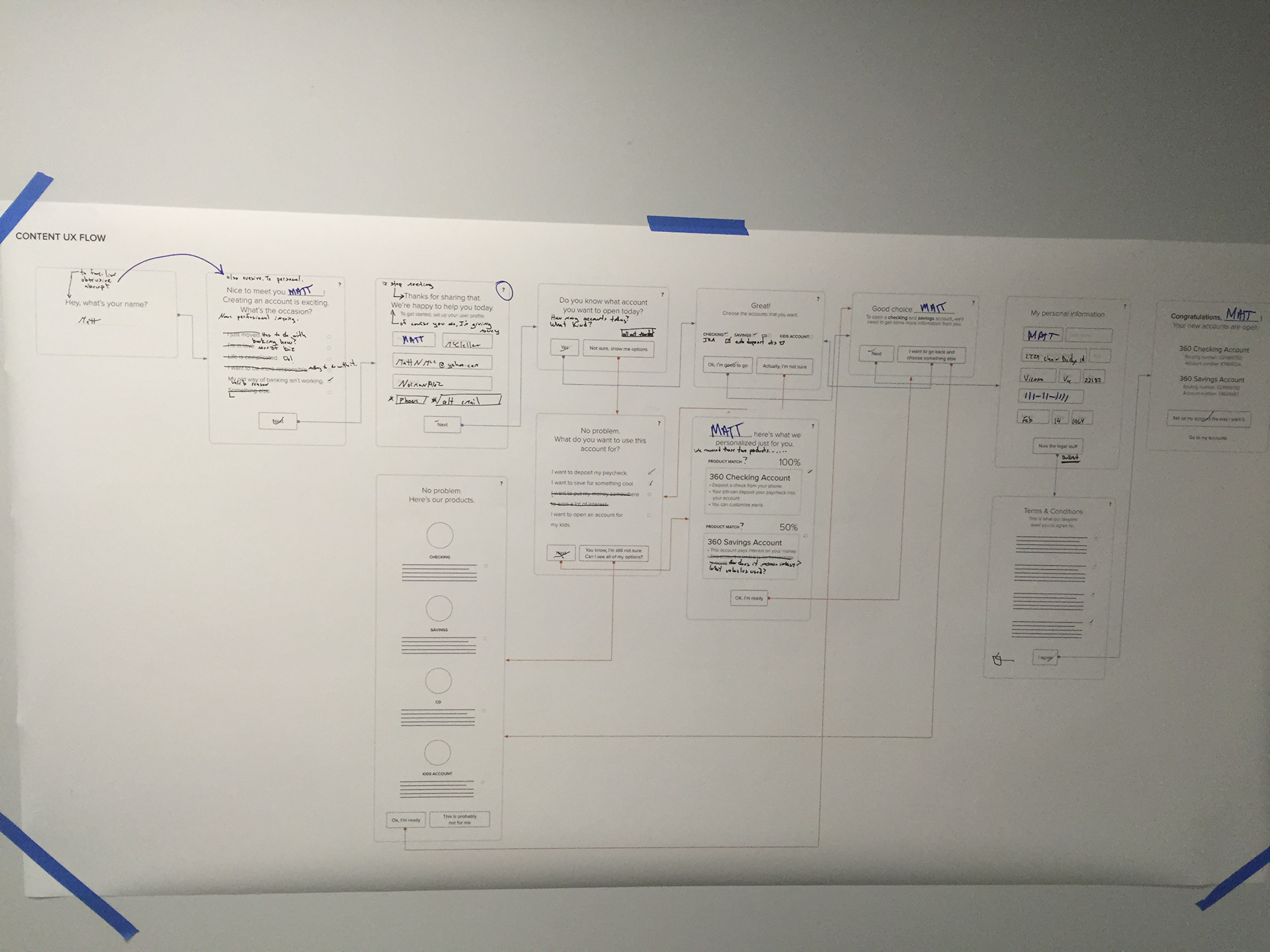
At this point, I had my Solution Sketches (printed out on poster paper) and I was ready to receive feedback. Receiving critical feedback can be difficult but if approached with a humble mindset, not only will you become a stronger designer, your Solution Sketches have a better chance at solving the problem.
The solution sketches focused on revealing & up-selling products (based on our competitive field research) within our on-boarding experience and testing language (based on our 360 Cafe associate user interviews).
*An action, not a deliverable
Storyboard
Storyboarding what not used in the map phase.
RESULTS
Through the deciding phase, we as a team, suggested building several prototypes that ranged from up-selling products early vs late in the on-boarding process to testing a professional style language tone vs a colloquial style language tone.

04 Prototype | Design Mocks & Create a Prototype
• Design Mockups
• Design Mockups
• Build a Clickable Prototype
OBJECTIVE
Continuing the theme, .how we communicate within the experience by shaping our language to build trust and understand our customers' expectations of being 'up-sold' still remained our primary goal.
DELIVERABLES
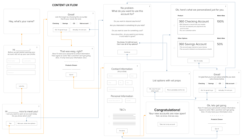
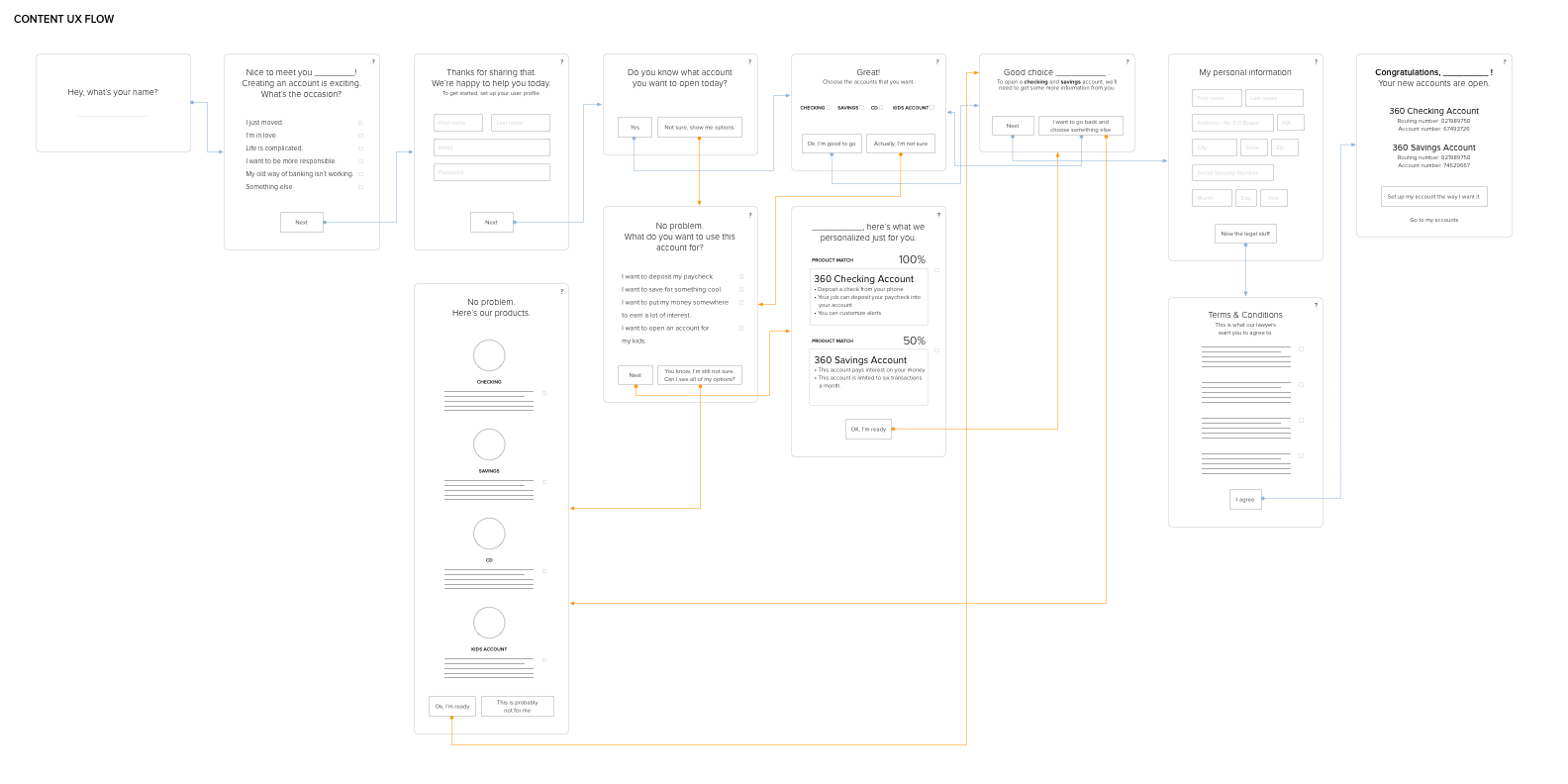
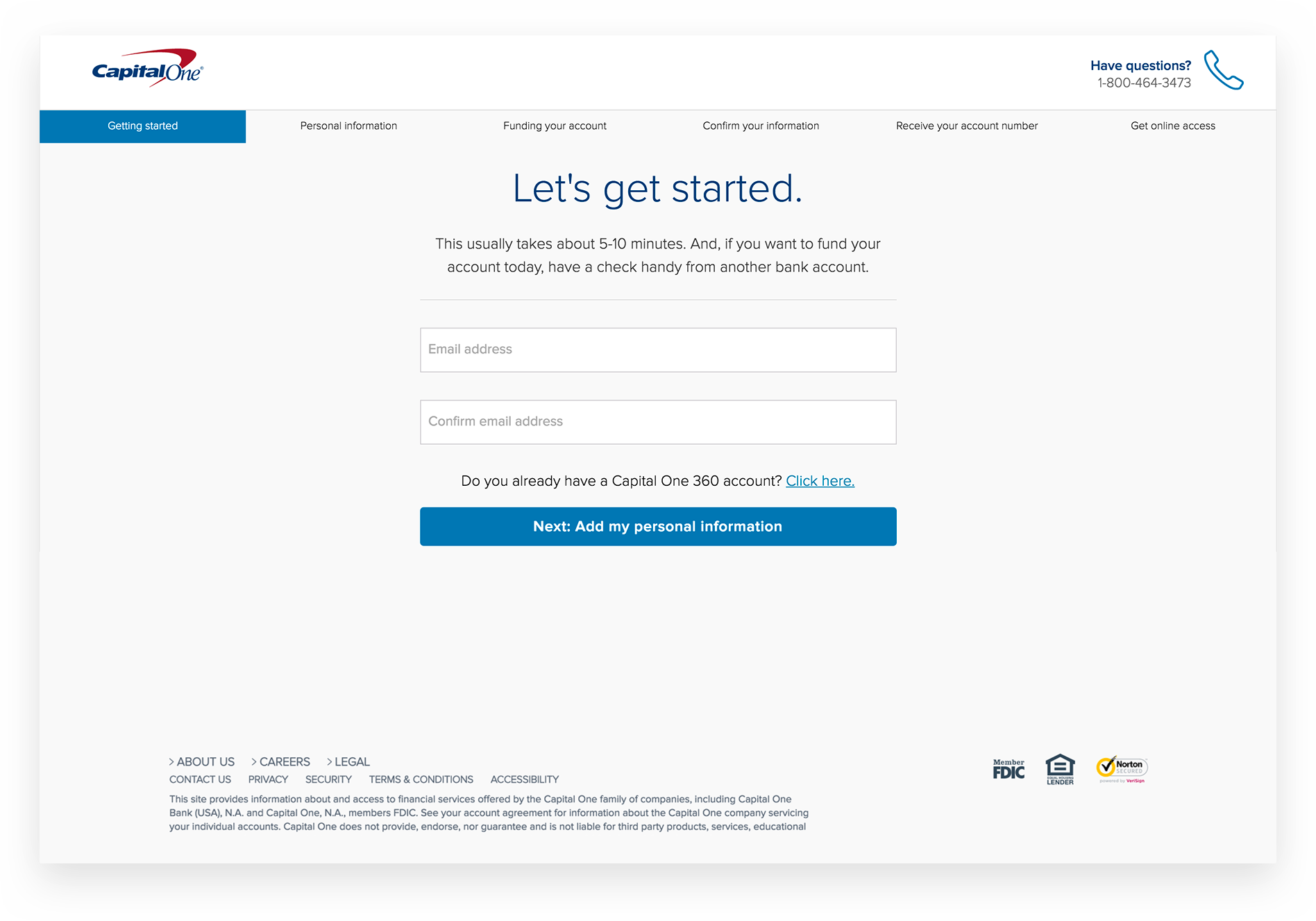
Design Mockups
Design Mockups
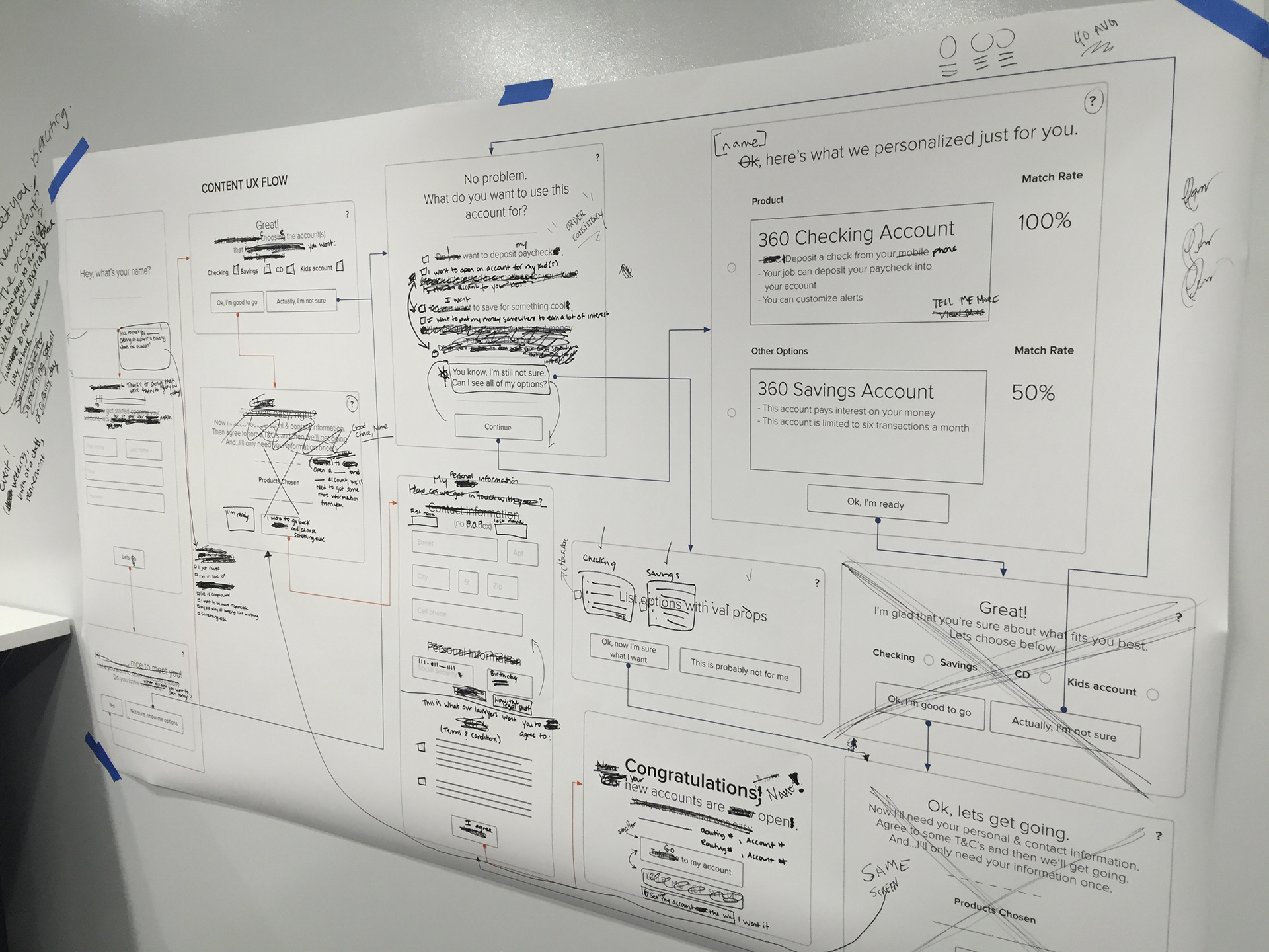
The prototyping phase began by first designing mocks (in Sketch) which were guided by the team's feedback, in the deciding phase. Over time, mocks increased in fidelity until they were able to cleanly convey what we were trying to solve; screen by screen, click-by-click.
Build a Clickable Prototype
During this time all of our prototypes were built on InVision which for the most part served its purpose.
RESULTS
This stage produced multiple prototypes that would target specific areas we targeted necessary to receive critical feedback from our customers.
05 Test | Get Feedback on Prototype
• Run a User Study
• Next Steps
OBJECTIVE
.
DELIVERABLES
Run a User Study
Run a User Study
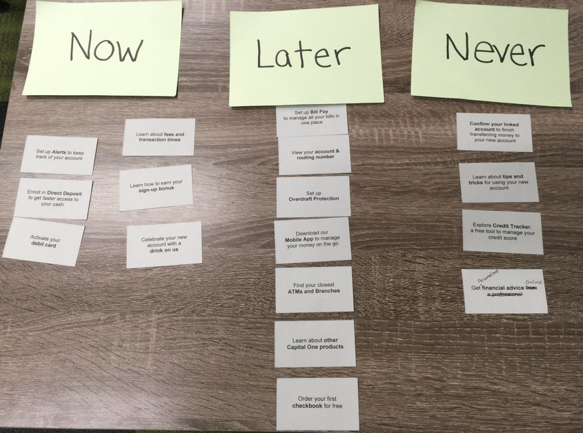
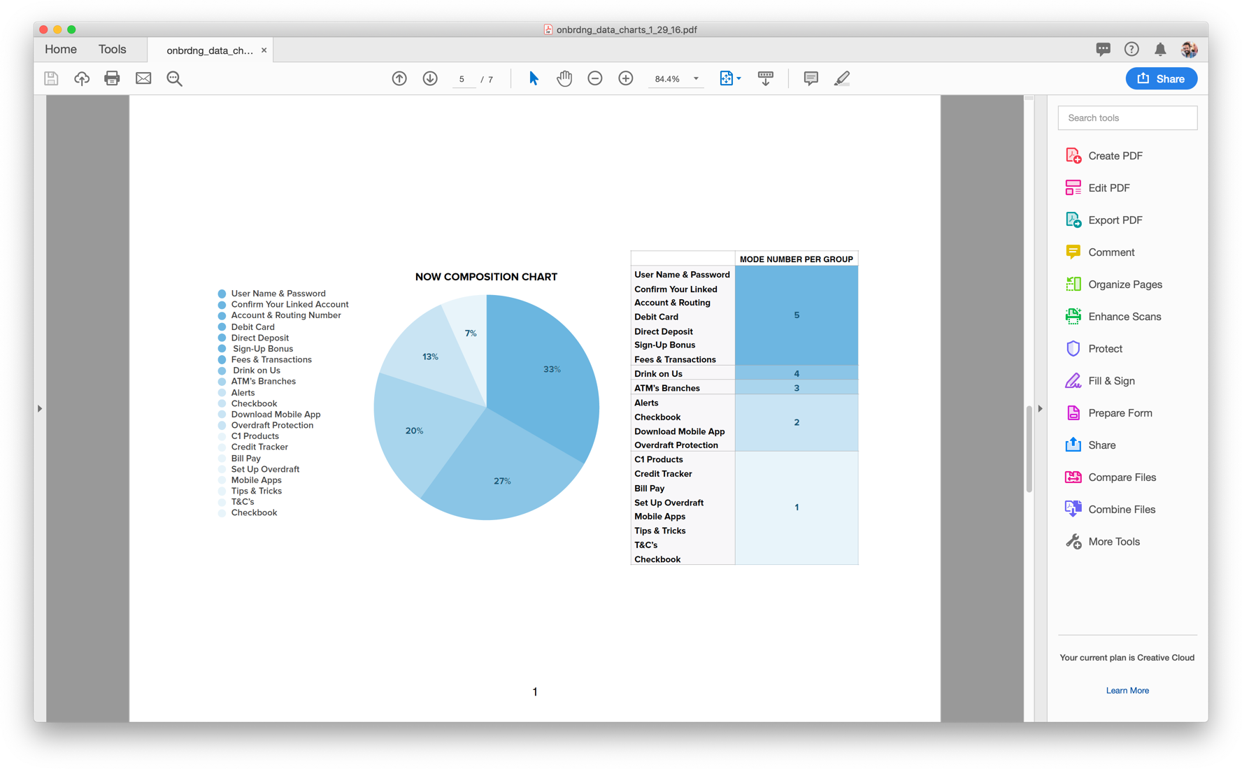
We conducted a role playing empathy exercise in which an account opening experience was simulated as if our customers were in a physical branch. After a user finished our prototype, each participant ended with a card sorting exercise and survey designed to capture key insights.
To capture feedback, I used a spreadsheet that lists all the questions asked, with participants names, occupation and time of test. I then created three color buckets to capture feedback; green for positive, yellow for neutral and red for negative. This method allowed me to capture patterns and/or themes within the feedback and helped us parse feedback effectively.
After testing language - professional vs colloquial and testing up-selling moments with the product experience, we synthesized the feedback and planned next steps.
Next Steps*
Our next steps were simple:
- Design high fidelity screens that reflected all the problems we solved.
- Prepped for production.
*An action, not a deliverable
RESULTS
After eight user study sessions of testing language & up-selling, we discovered when it came to people’s money, how you speak, and the manner in which you use language plays a huge part in trusting an establishment and giving them your business.
Some of the qualitative feedback showed us the age range between 18-40 were very receptive to a colloquial style of language (“I wish all banks spoke like this”) but 40 - 65 were highly defensive towards the lack of professionalism used in colloquial language, particularly when it came to their money (“don’t play with my money”).
Some of the qualitative feedback showed us the age range between 18-40 were very receptive to a colloquial style of language (“I wish all banks spoke like this”) but 40 - 65 were highly defensive towards the lack of professionalism used in colloquial language, particularly when it came to their money (“don’t play with my money”).
From the eight rounds of testing we were also very confident, based on the design thinking card-sorting exercises, when to tastefully introduce and up-sell products. At this point, we believed user study options have been exhausted and design should focus on high fidelity mocks / production (to the engineers).
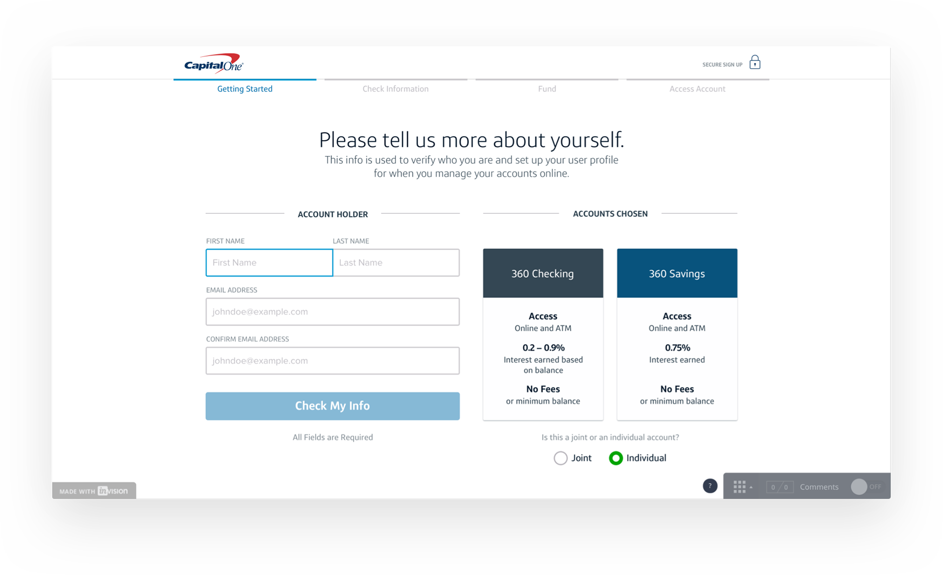
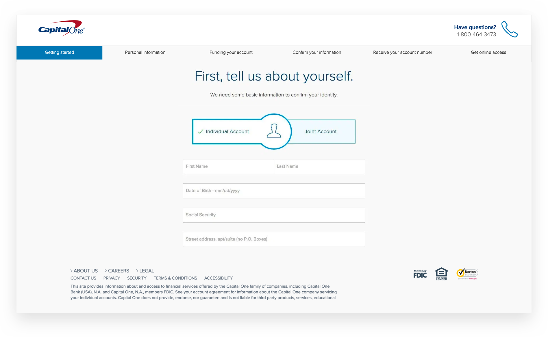
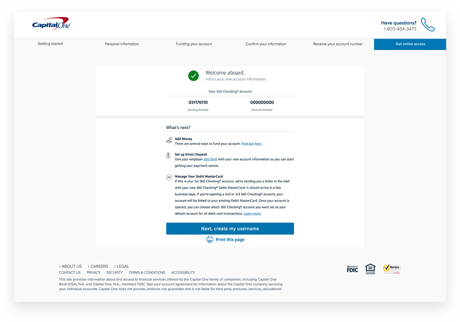
High Fidelity | A New Look
Below is a showcase of mocks that were designed based off research, peer feedback and qualitative & quantitative data. Without the design process we followed, I don't believe we would've been able to have the outcome OAO achieved.
(read results below).
Final Result | Outcome
OAO averaged 50,000 unique users a month with a conversion rate of 2% (1000) in 2015. November 2016, conversion rates increased to 9% after a revised version of OAO was released based on key insights collected from nine months of design & research.